
Opportunity Pipeline View
Introducing the Opportunity Pipeline View aka the Deal Manager. This post will show how to configure and use the view.


Intro
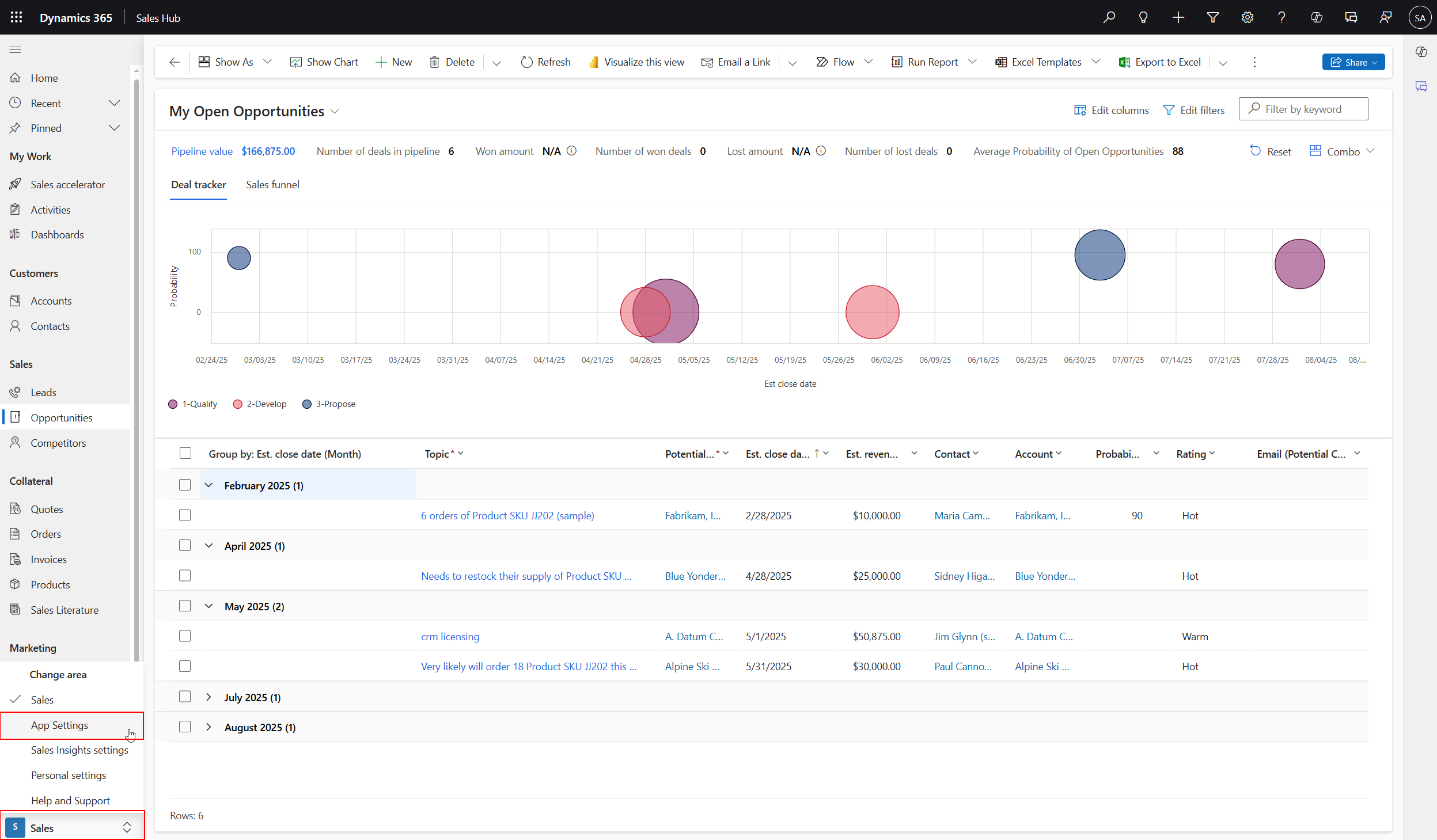
Have you seen the Opportunity Pipeline View? You may also know this as Deal Manager.
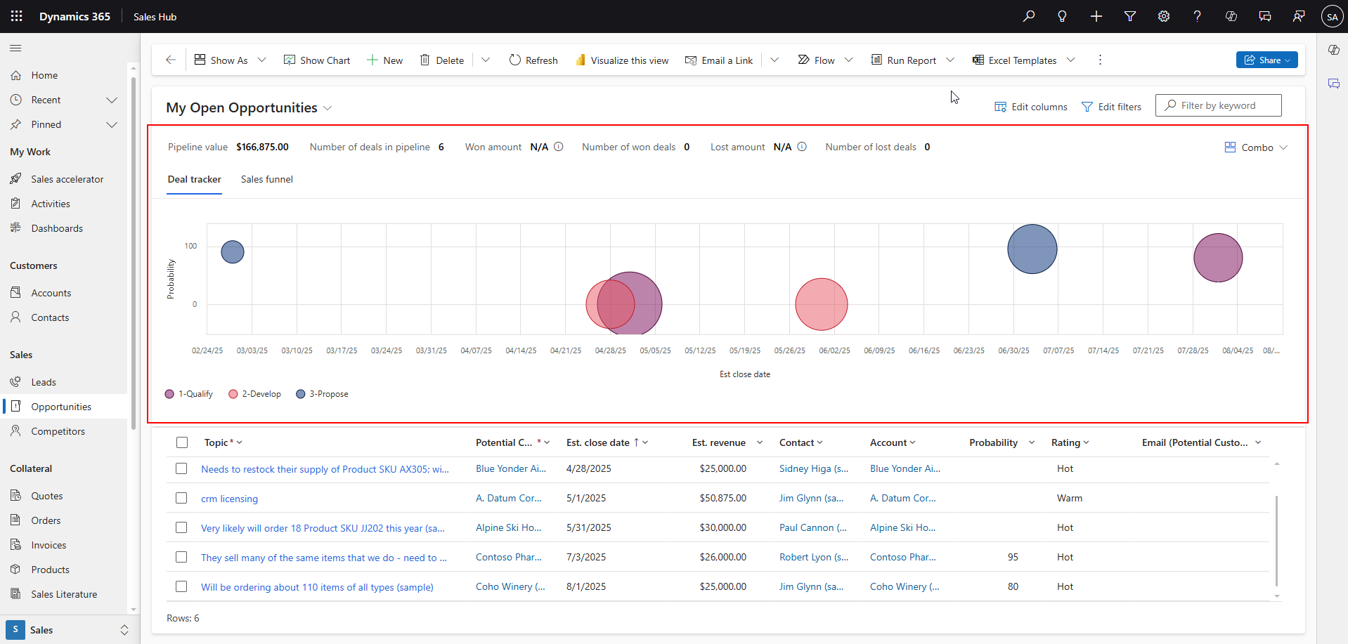
This feature can be found in Dynamics 365 Sales in the Sales Hub app.
Visualizations
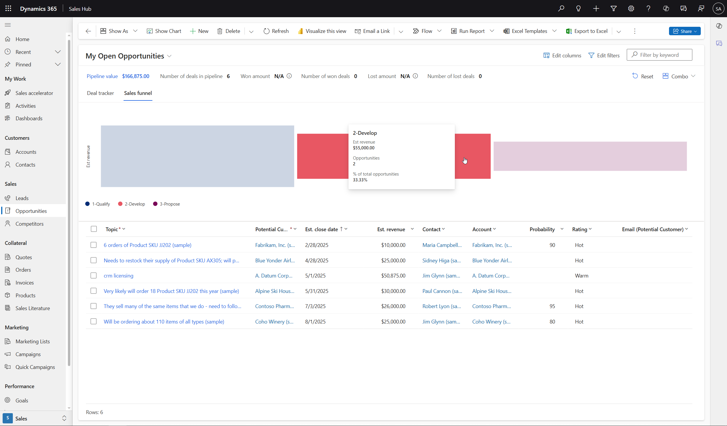
Two different visualizations are shown by default: the bubble chart and the sales funnel chart.
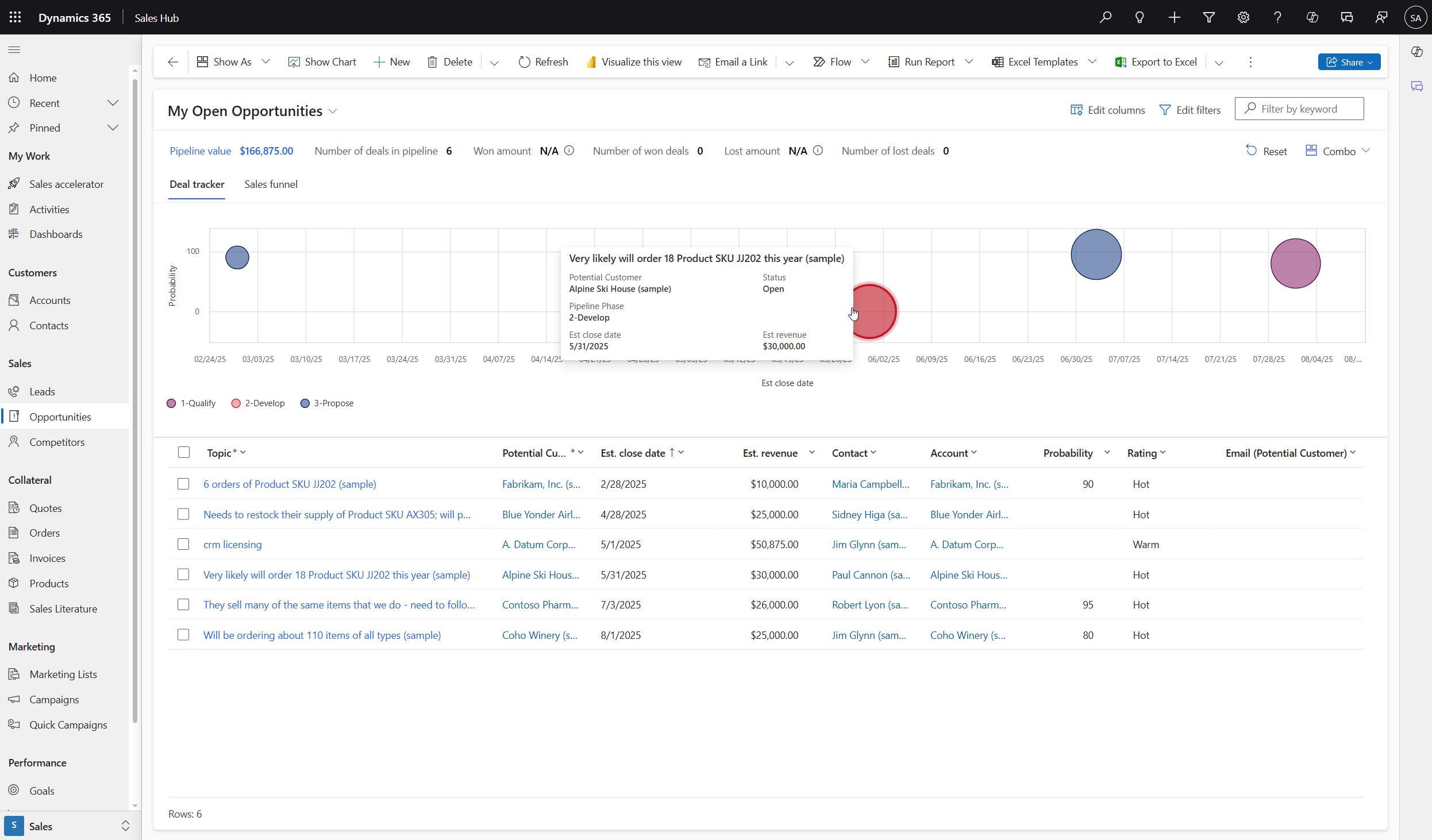
By default, the bubble chart shows the following information:
- x-axis: Displays the opportunity score if you have Sales Insights; otherwise, it displays the deal probability.
- y-axis: Displays the close date. This is a smart column that displays the actual close date or estimated close date, depending on whether the opportunity is closed.
- Size of the bubble: Displays revenue. This is a smart column that displays the actual revenue or estimated revenue, depending on whether the opportunity is closed.
- Color of the bubble: Indicates the opportunity grade if you have Sales Insights; otherwise, it displays the pipeline phase.
Sales funnel chart: Displays a funnel based on the sum of estimated revenues across different pipeline phases.
Configure Metrics
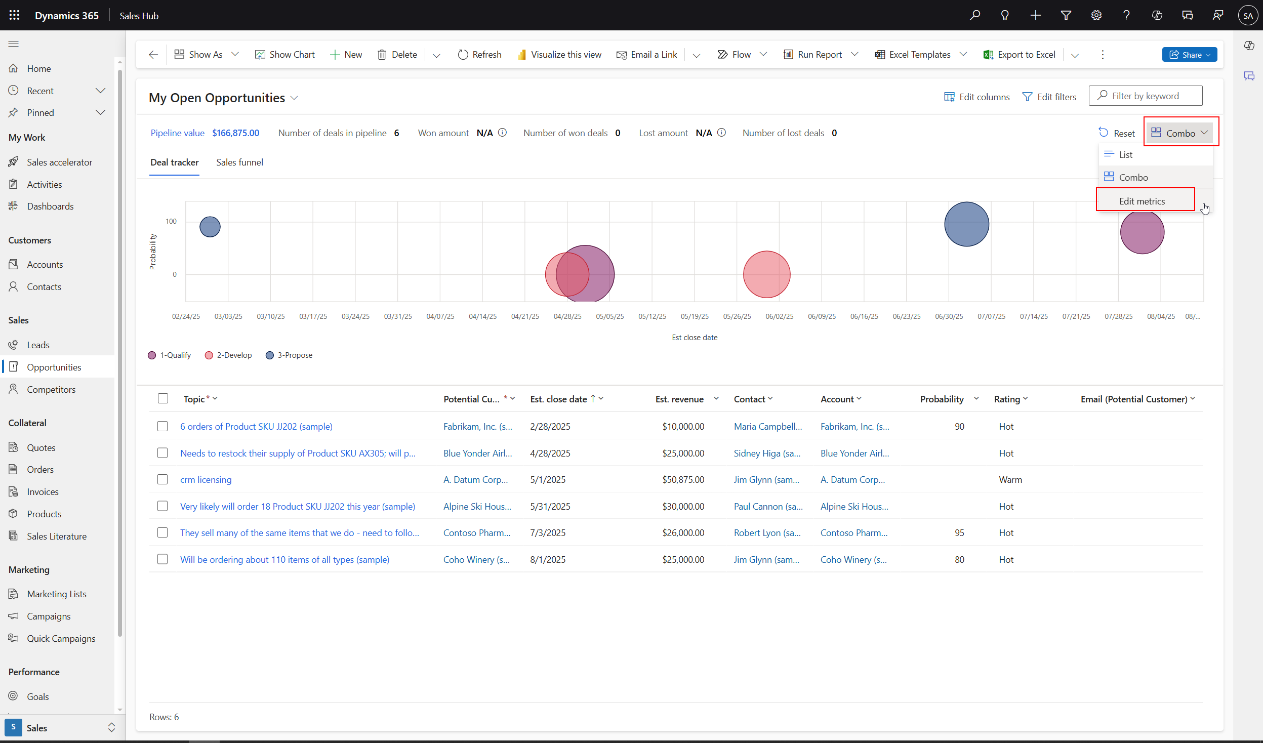
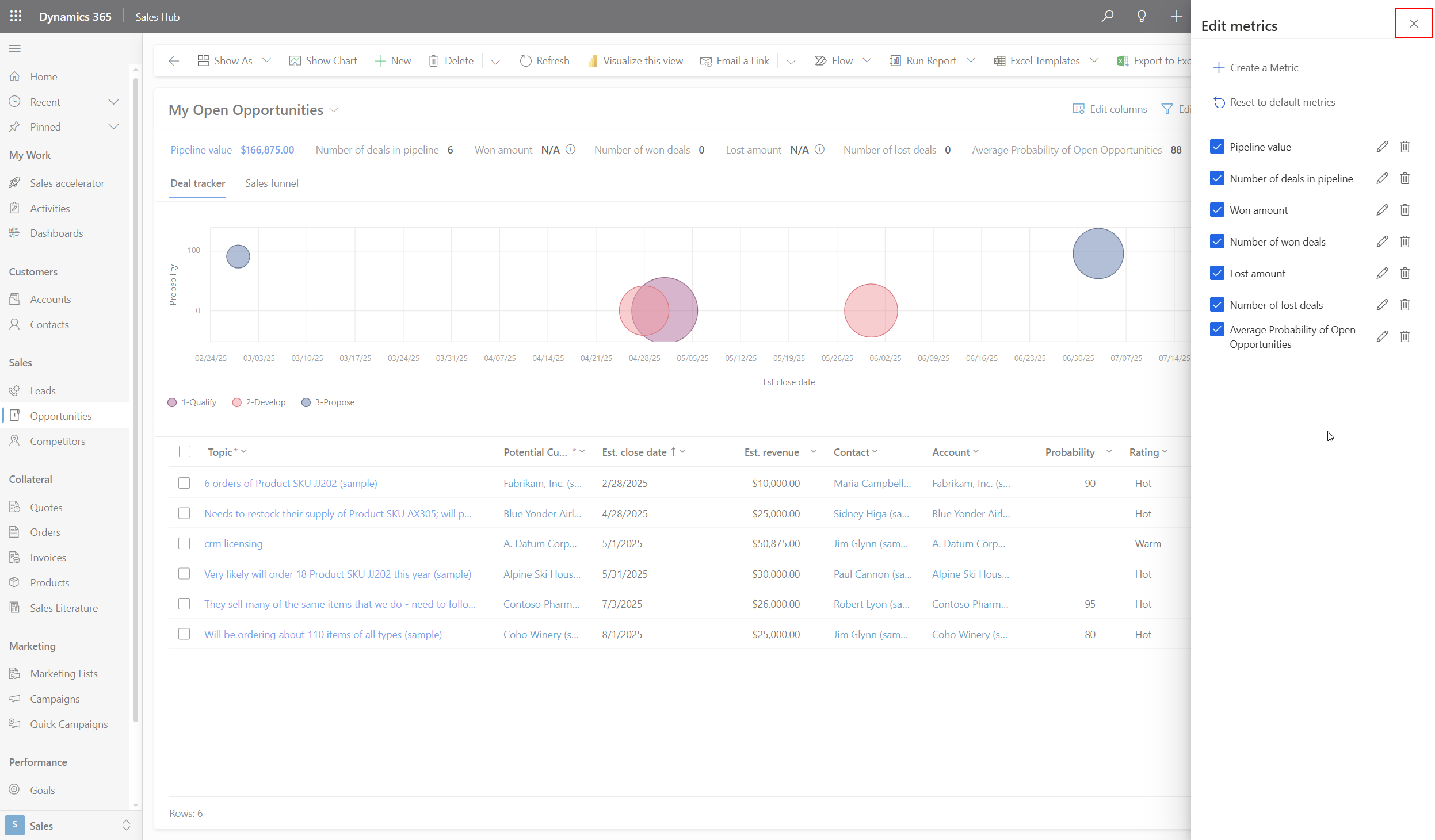
Notice along the top of the Pipeline View there are several metrics. These metrics are configurable.
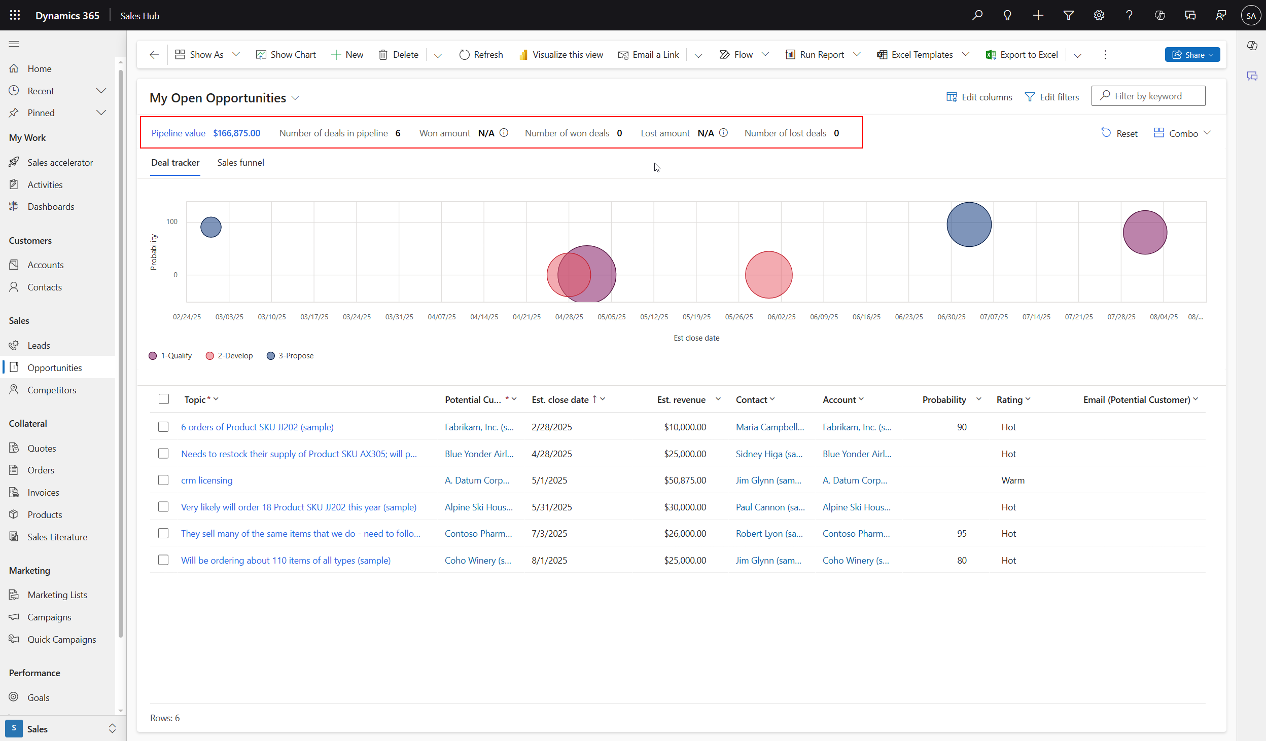
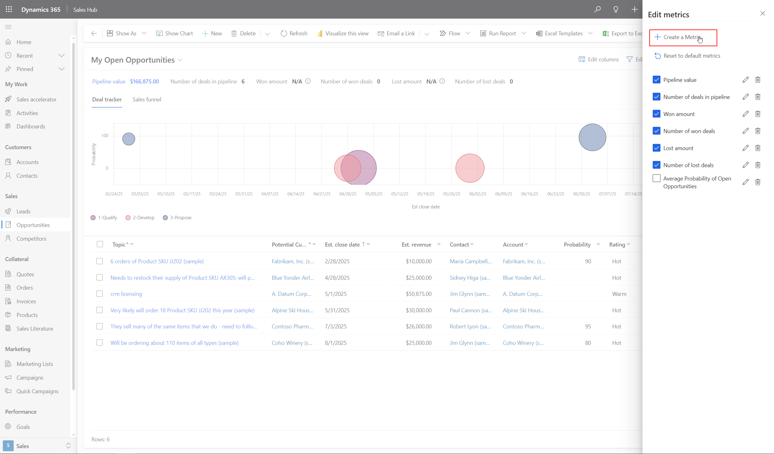
We can add or remove metrics as needed by clicking the Combo drop down button and selecting "Edit metrics".
Click the "Create a Metric" button.
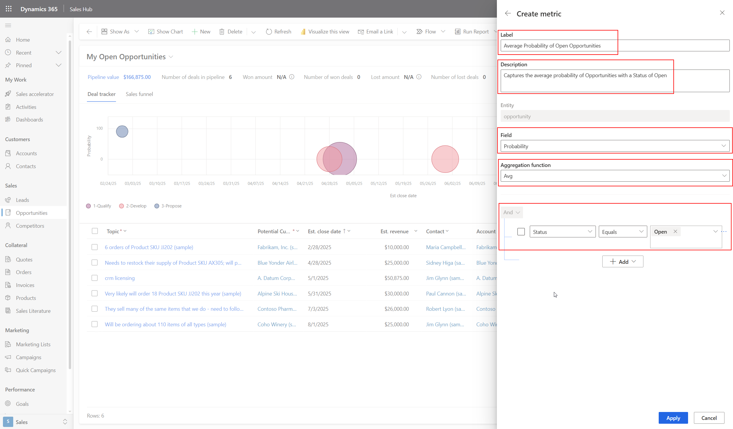
Give the metric a Label, Description, select the attribute the metric should use, the aggregate function, and optionally, a filter for the dataset. Then click the blue "Apply" button.
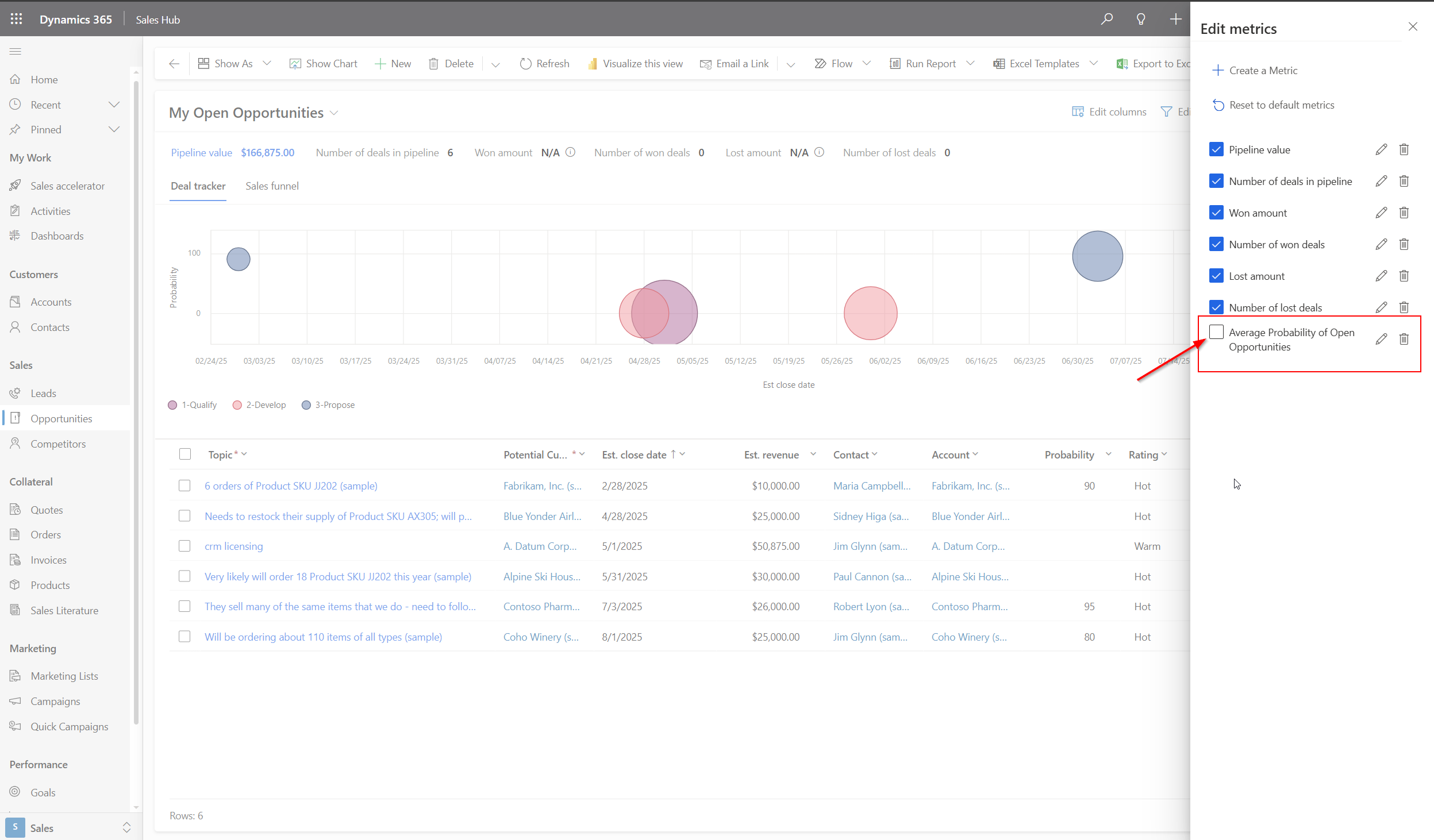
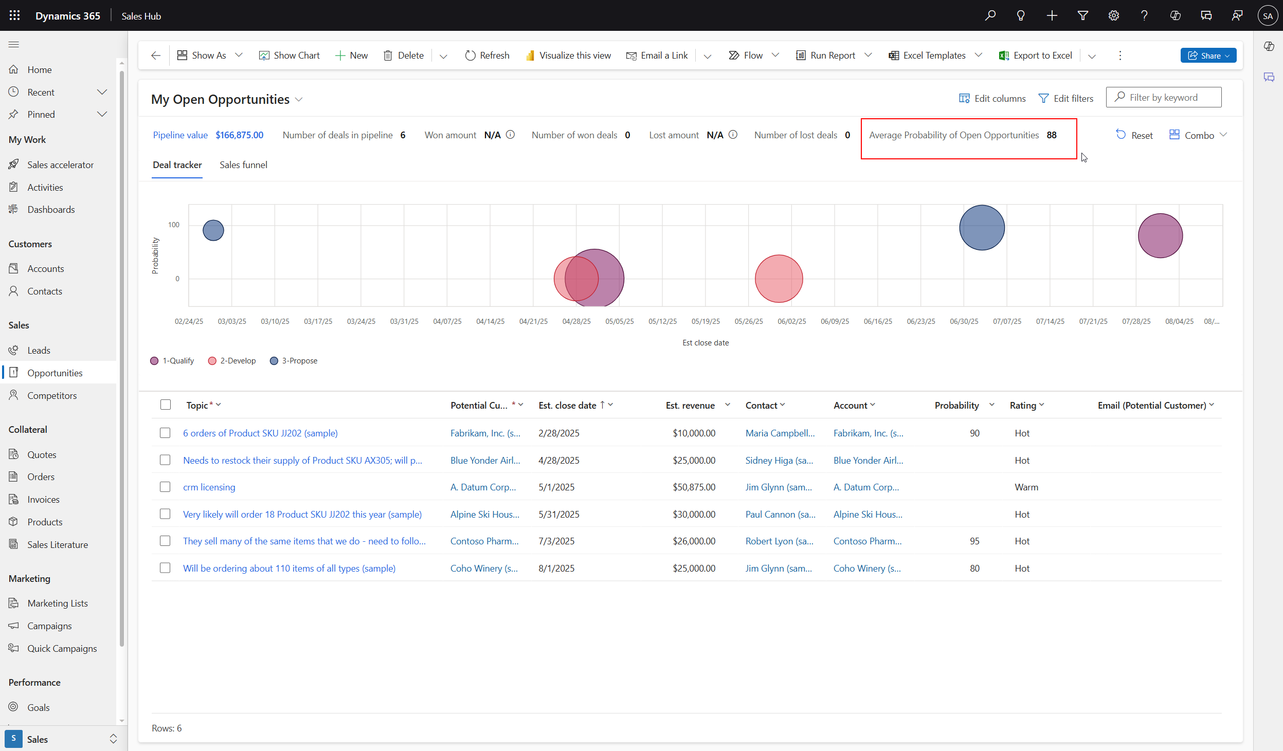
The metric now shows in the list of available metrics. However, it seems that is is not selected. Check the box next to the new metric to show it on the Pipeline View.
Close the metric pane and view your new metric!
Results
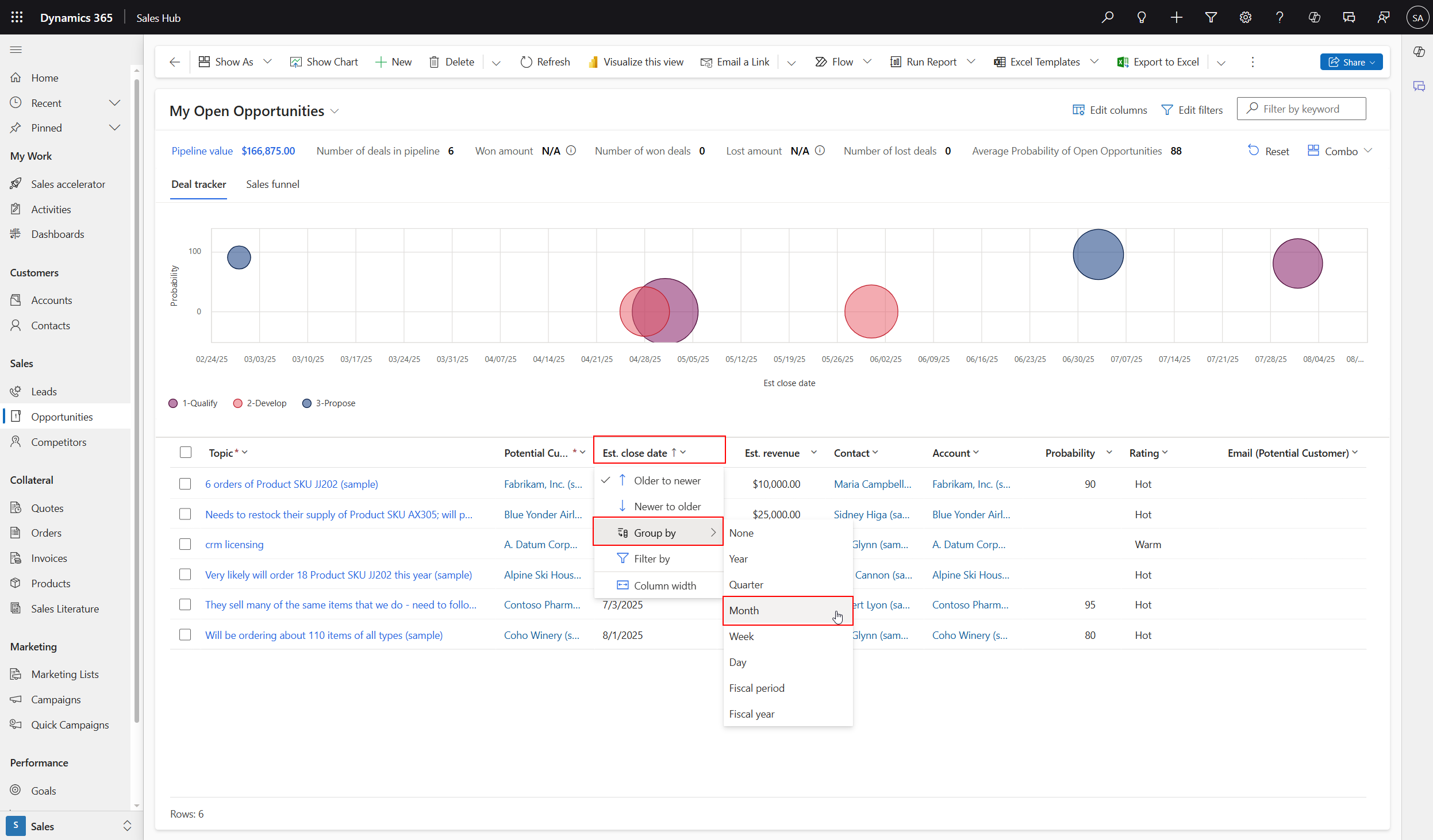
Taking a look at the grid of Opportunities below the visualizations, we can also modify how this data is shown. By selecting a column header, certain Group By functions are available depending on the data type of the column. As an example, I will group this list of Opportunities by the Month of the Estimated Close Date.
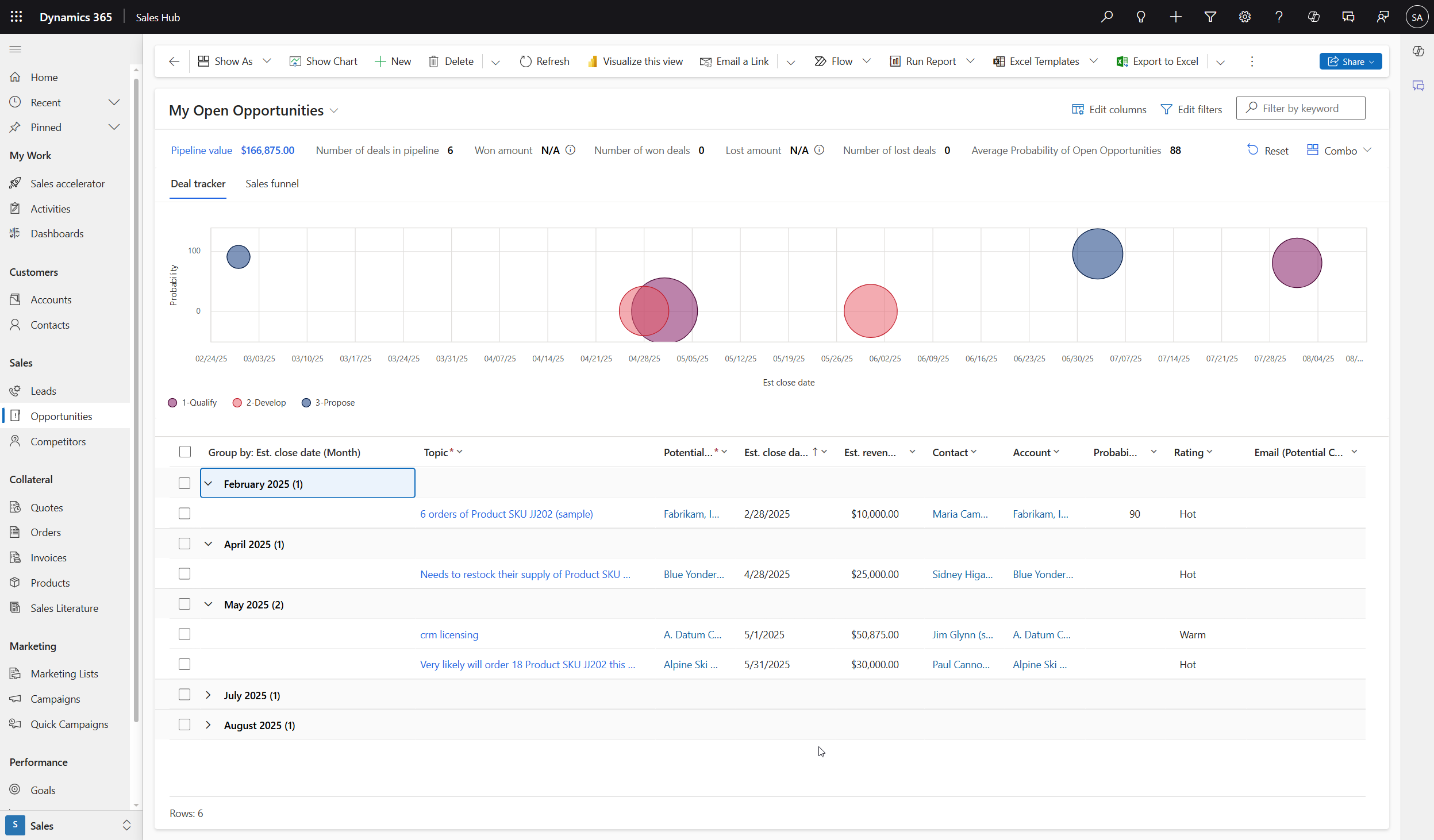
The resulting view can be easier to manage if we are tracking our Opportunities based on the Estimated Close Date.
Sure - these examples are basic but this begins to illustrate how we can empower our users to visualize and organize the data they need to make informed decisions.
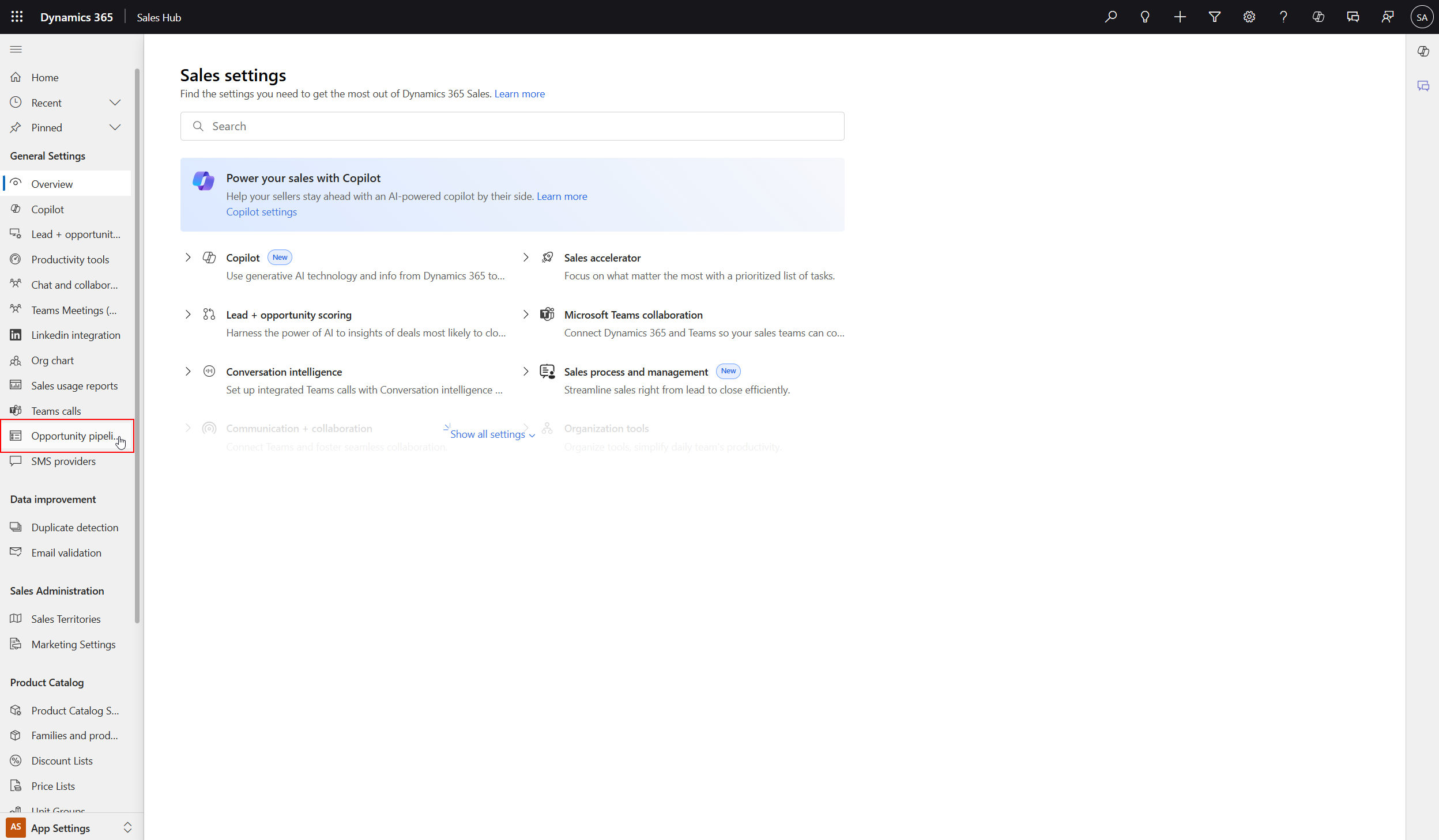
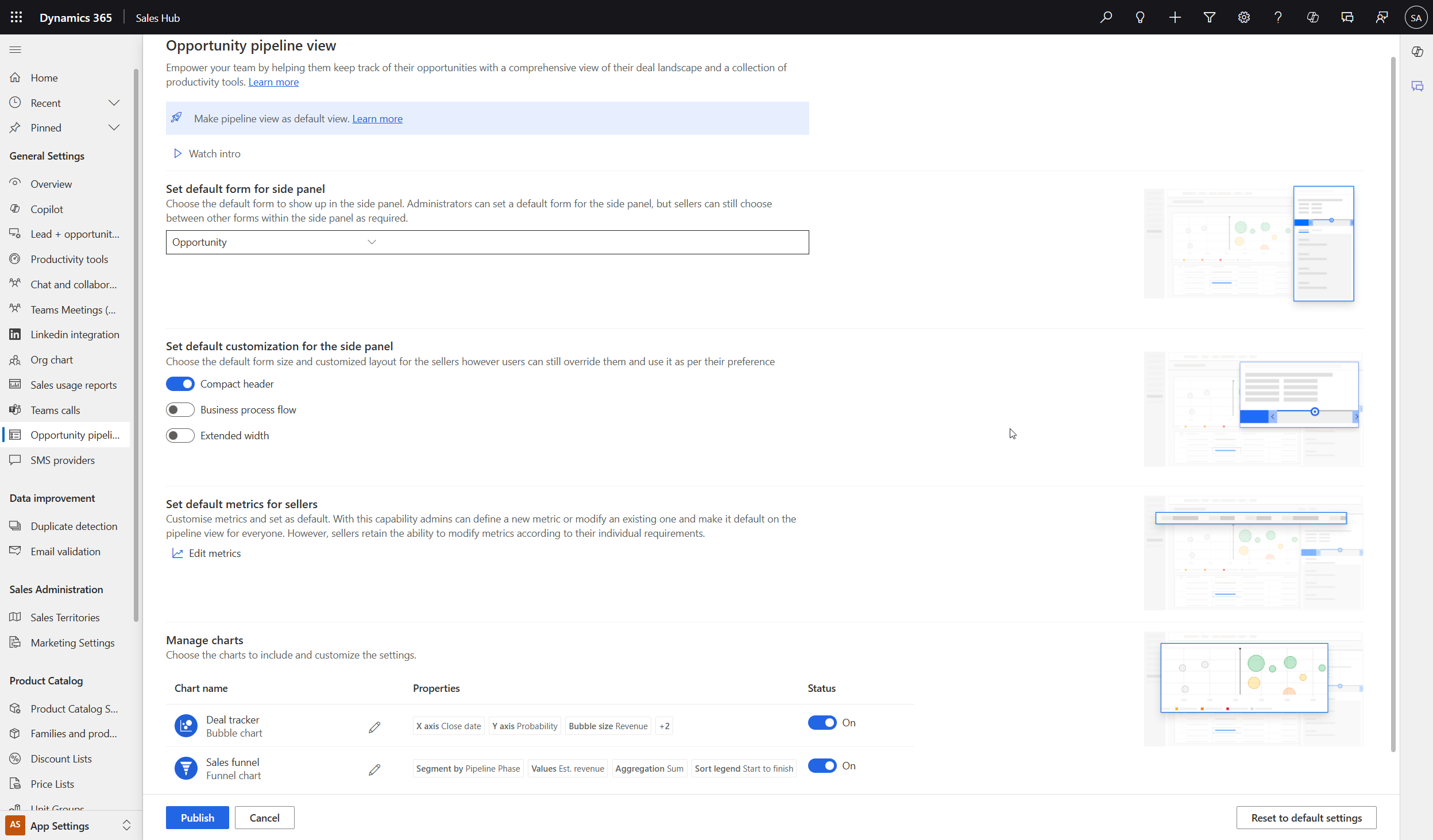
Additional Settings
Additional settings can be found in the App Settings area of the Sales Hub app such as which Charts are enabled, the default form for the side panel, and default form size and layout.
How do you leverage the Deal Manager in your organization?